Improving the usability of the Child's learning app.
Context
Yeti is your child's friend, coach, and learning partner, ensuring fun, mindfulness, and engagement in learning while also nurturing values and well-being.
Challenge
Redesign two screens from the primary experience of the Yeti My Friend app and provide mock-ups of your suggestions.
Duration
3 days.
Research
The initial research for the redesign of the Yeti app aimed to understand the needs, behaviors, and preferences of children and parents regarding children's apps, highlighting significant differences between age groups.
The priority was children's autonomy in using the app, with a focus on clear visual elements and robust parental controls.
The tight deadline of only 3 days to complete the project underscored the need for an agile and efficient approach in collecting and analyzing data to inform design decisions.

Research Insights
I have researched children's apps development for insights into needs, behaviors, trends, best practices, and security.
The behavioral and ability differences between ages 3–5, 6–8 and 9–12 are vast.
The design was focused in autonomous use with no need for adult assistance.

• Use clear icons for real-world understanding.
• Direct connections are crucial for young kids.
• Add sound for navigation as kids may not read.
• Choose bold colors and clear hierarchy.
• Simplify button text for clarity.
• Rely more on visuals, less on text.
• Choose child-friendly typefaces.
• Opt for playful sans-serif fonts.
• Avoid bottom buttons to prevent mistakes.
• Provide feedback for every action.
Parents Personas
• Demanding users, critical in reviews.
• Implement parental controls (time limits, rules).
• Value reviews from experts and parents.
• Willing to pay to avoid ads.

Benchmark
I analyzed direct and indirect competitors, seeking Insights to understand user interactions.
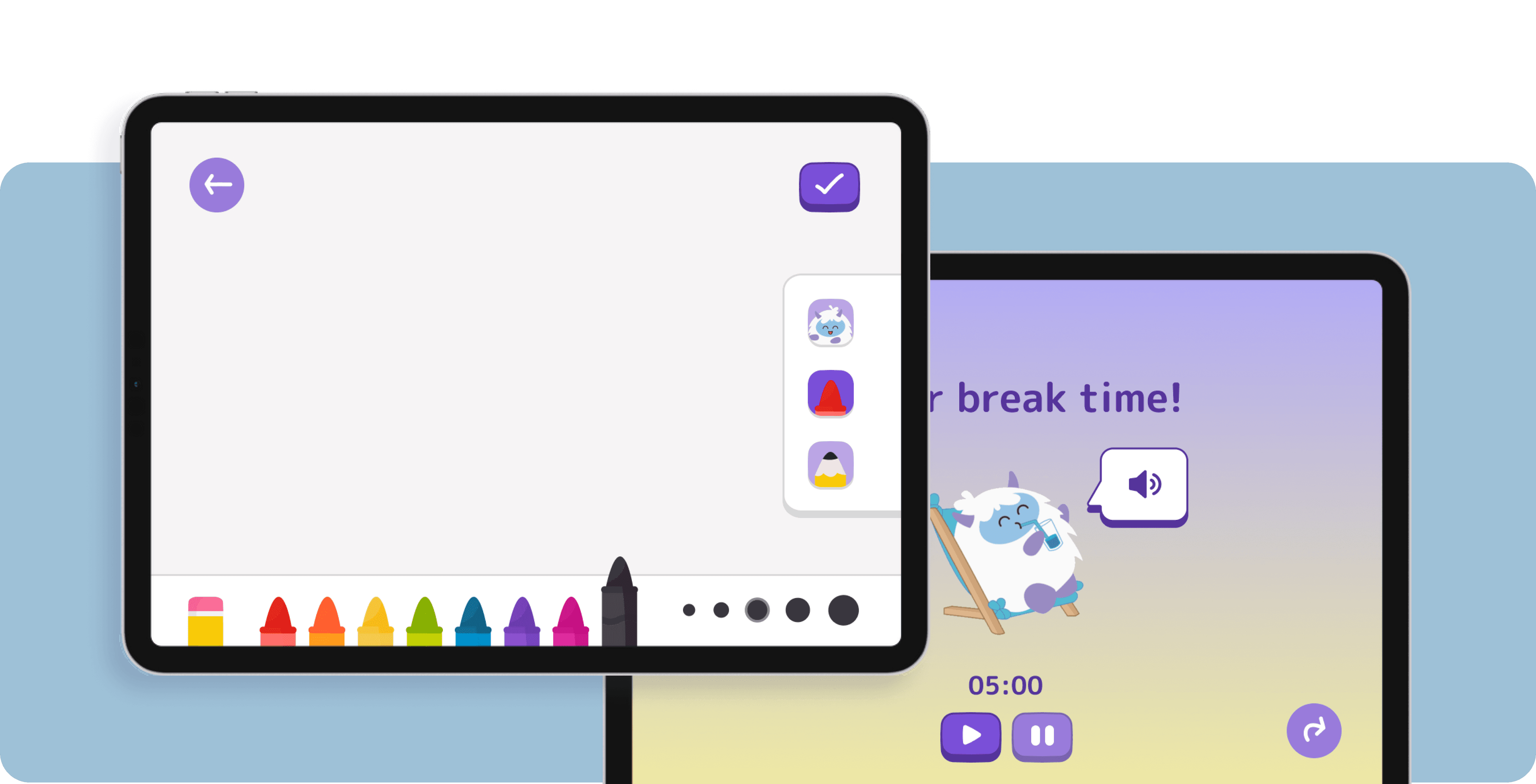
The two screens chosen for redesign in the main app experience are the Drawing Screen, where the child is invited to portray themselves using the available drawing tool, and the Break Time experience, during which they wait 5 minutes to drink water and resume the task.

First chosen experiences for Redesign - Drawing Screen
Drawing Experience
In this screen, children are encouraged to depict themselves utilizing the provided drawing tool.
Second chosen experiences for Redesign - Break Time
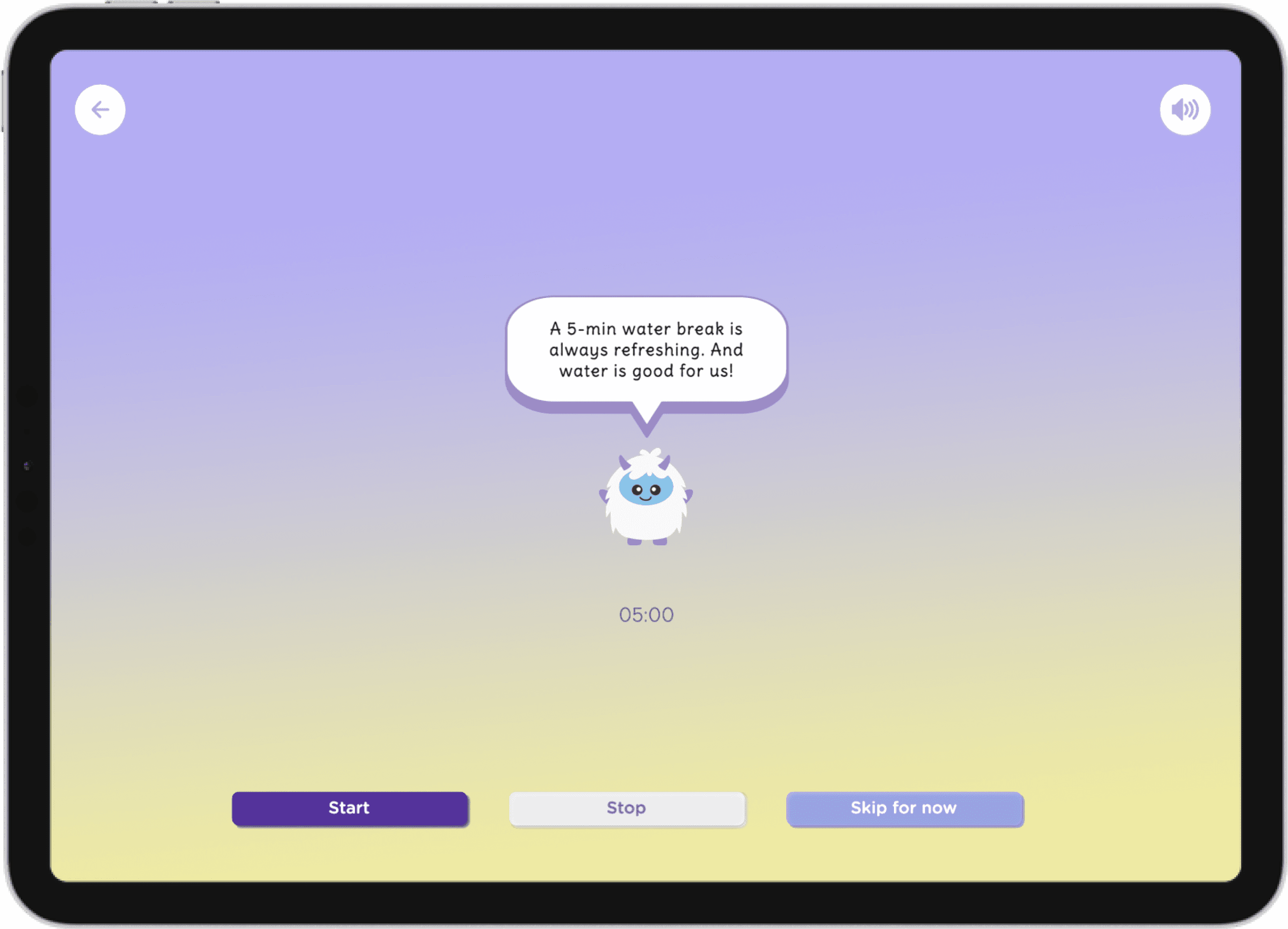
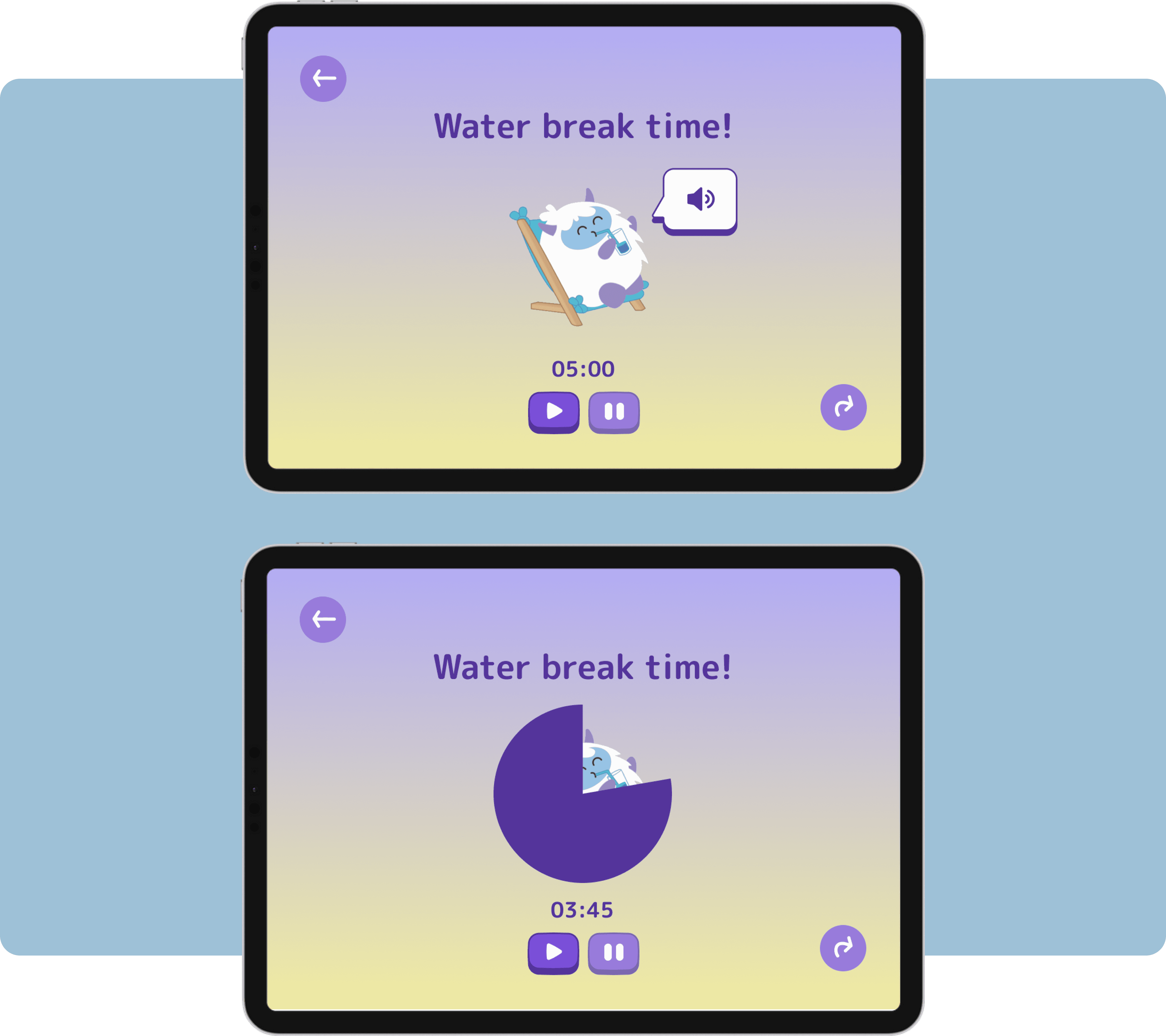
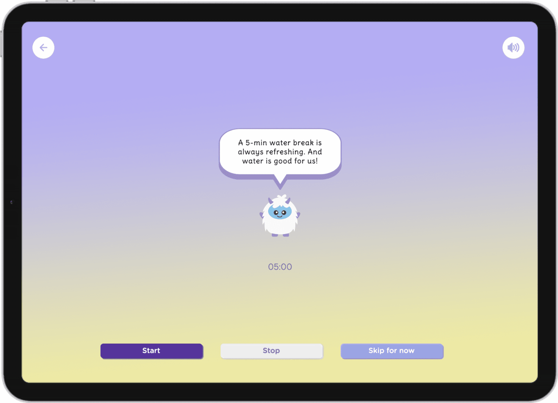
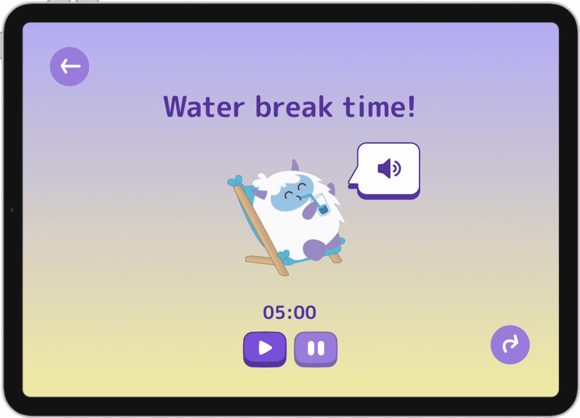
Break Time Experience
The children wait for 5 minutes before they are able to drink water and continue with the task.
Usability testing
The usability test was conducted with a five-and-a-half-year-old child to assess the product's alignment with user needs. It aimed to identify issues and explore alternative interactions for the chosen app redesign. Analysis focused on functionality effectiveness. Understanding children's cognition and interaction is crucial for enhancing user experience.
Usability testing with a 5 year-old child
Doodle screen
• She managed to find the brush for drawing.
• Couldn't select the color from the color palette.
• Changed the transparency and couldn't draw.
• Couldn't change the brush thickness.
• Didn't know how to erase the drawing.
Break Time screen
• She needed help understanding what was written on the interface buttons.
• Understood it was a 5-minute break but had no sense of how long 5 minutes were.
• Prioritized visual hierarchy.
• Minimal text for autonomous interaction.
• Icons resemble real-world objects.
• Adjusted brush tip thickness.
• Interactions include character stickers and diverse drawing tools.


Before

After
• Stopwatch providing a visual sense of time.
• Character performing the same action as the child should do.
• Real World icons for “Play”and “Stop” Buttons.
• Prioritized visual hierarchy.
• Minimal text for autonomous interaction.
Before
After
Next Steps
Design the high-fidelity prototype and perform new usability tests to assess whether the changes addressed the initially identified issues and if the new design meets the users' needs.